20 Living Room Color Schemes Ideas to Try at Home Now

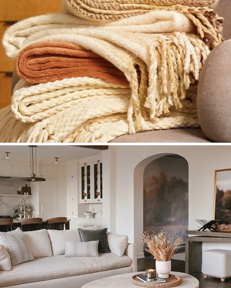
Image Credit: Left image @haddadvs on Instagram, right image @dreamhomedecor202025 on Instagram – featured image made by combining these 2 images.
Choosing the right colours can feel hard, but the right living room color schemes make the whole room feel calm and put together. You do not need a designer or a big budget to get that feeling. A clear palette helps you choose paint, cushions, rugs and art with less stress, and it stops the room from looking like a mix of random pieces. In this guide, you will find 20 simple colour ideas for walls, sofas, wood, metal and soft furnishings that work in small rooms and rented homes too. Pick one scheme that fits your light and your furniture, try it in one corner first, and see how the room feels when you sit down tonight. If you want a warmer feel first, see 20 Cozy Living Room Ideas to Try at Home Now Today.
Warm Ivory Neutral Palette
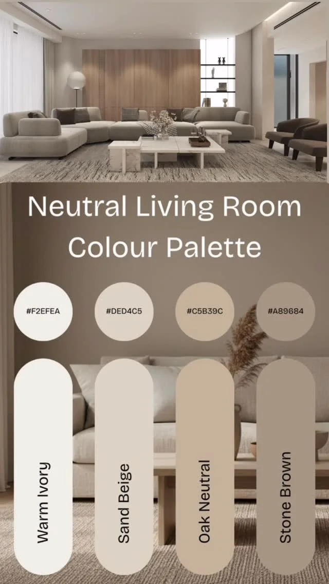
Image Credit: @haddadvs on Instagram – Instagram post
Warm ivory walls make a room feel bright without feeling cold, and they give every other colour a soft place to sit. Pair ivory with sand beige cushions and light oak wood, and the whole space starts to feel calm. Add one darker tone, such as stone brown, in a throw or a frame.
Keep the palette to three or four shades, and repeat each one at least twice in the room. Test paint in daylight and at night, because ivory can look yellow under warm bulbs. With a little care, this gentle base suits most furniture and most seasons.
Soft Sage Green Walls
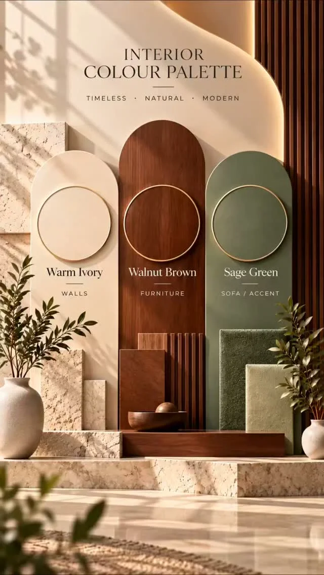
Image Credit: @dreamhomedecor202025 on Instagram – Instagram post
- Paint one wall sage green and keep the other walls warm white, so the colour feels fresh and not heavy.
- Pair sage with natural wood, cream linen and a few green plants for a calm, garden feel.
- Add brass or light wood details, because warm metal stops green from looking cold.
- Use sage cushions on a cream sofa if you do not want to paint a wall yet.
Sage green suits rooms with good daylight, and it pairs well with white, wood and soft beige. Start with cushions or a throw if paint feels like a big step, then move to a wall when you feel sure. This soft green makes a busy room feel slower and more restful.
Terracotta Warm Accent Tones
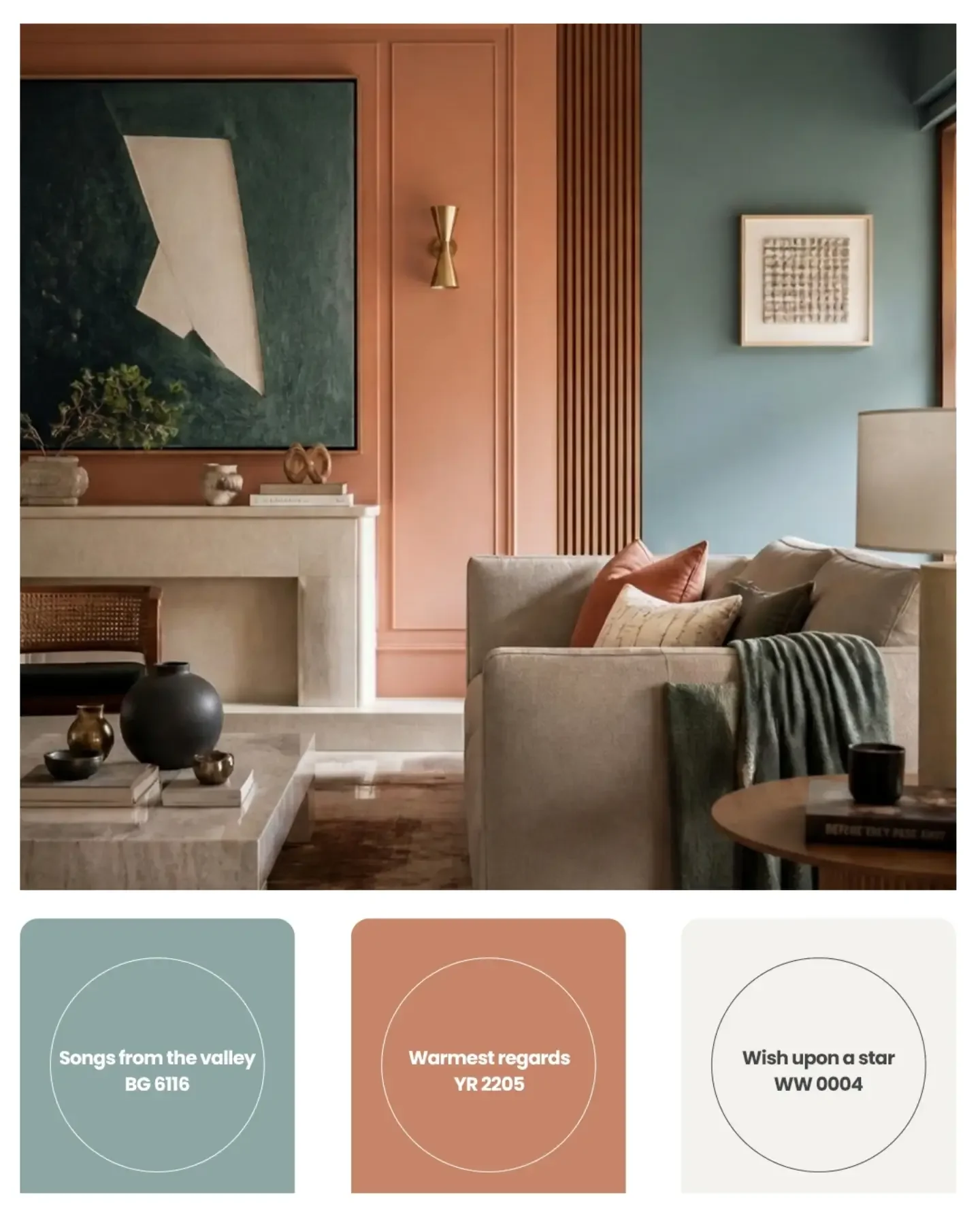
Image Credit: @birlaopus.create on Instagram – Instagram post
Quick Tip:
Use terracotta as an accent, not as the main colour, and let it warm up a cream or white room. Try terracotta cushions, a clay pot, a throw or one framed print, and keep the rest of the room calm so the warm tone stands out.
Terracotta pairs well with cream, light wood, olive green and soft beige, and it suits both plain and patterned rugs. Add it in small layers first, then add one more piece if the room still feels cool. This warm earth tone brings sun into a north facing room.
Dusty Blue Calm Corners
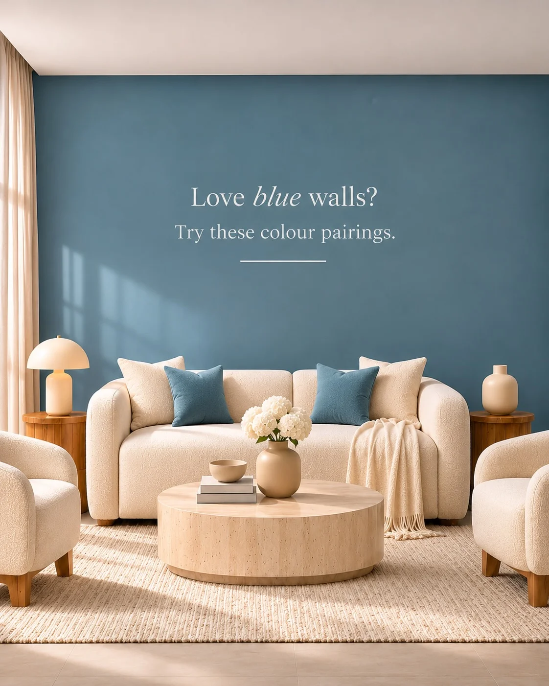
Image Credit: @asianpaintsarabia on Instagram – Instagram post
Before: A plain white room with grey furniture can feel flat and a little cold, even when the furniture is new. The corners look empty, and nothing in the room feels soft or settled.
After: A dusty blue accent wall behind the sofa gives the same room depth and a quiet, calm mood. Cream cushions, warm wood and soft light make the blue feel gentle, and the corner becomes a place to sit and rest.
Paragraph: Dusty blue works best with warm white trim, light wood and cream textiles, because those warm details stop blue from feeling cold. Try it on one wall first, and use blue cushions or art if paint feels too bold. This soft blue suits reading corners and evening light.
Charcoal Grey Bold Contrast
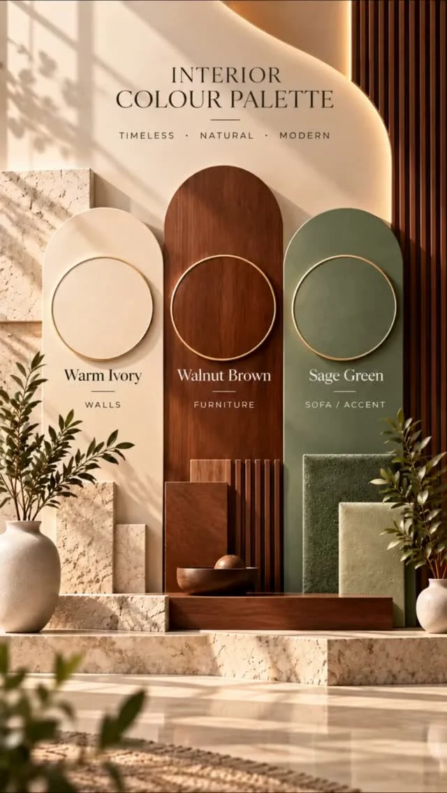
Image Credit: @geeta_home_studio on Instagram – Instagram post
Steps: 1. Choose one charcoal piece, such as a sofa, a wall or a rug, and keep the rest of the room light. 2. Add warm white walls and light wood to balance the dark tone. 3. Use brass, cream cushions and soft light to stop the room feeling dark. 4. Step back and check the balance from the doorway before you add more dark pieces.
Paragraph: Charcoal gives a room a clear focal point, and it makes cream, wood and brass look richer by contrast. Use it in one place first, because too much dark colour can shrink a small room. With light walls and warm light, charcoal feels smart and calm, not heavy.
Blush Pink Soft Touch
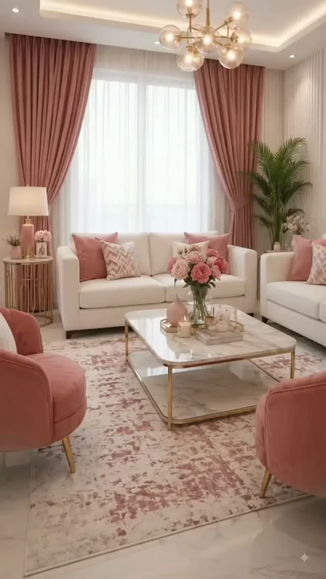
Image Credit: @designbloom786 on Instagram – Instagram post
Do: Use blush pink in cushions, a throw or a rug, and pair it with cream, soft grey and light wood. Keep the pink soft and dusty, so the room feels calm and grown up. Add one darker tone, such as charcoal or deep green, to give the palette depth.
Don’t: Use bright pink on a whole wall, because it can feel loud and hard to live with. Mix blush with too many bright colours in one small room. Choose shiny pink fabric that shows every mark.
Paragraph: Blush pink adds warmth without shouting, and it suits cream sofas, grey chairs and light wood floors. Start with two cushions and a throw, then add a rug if you love the tone. This gentle pink makes a plain room feel softer and more welcoming.
Navy Blue Classic Depth
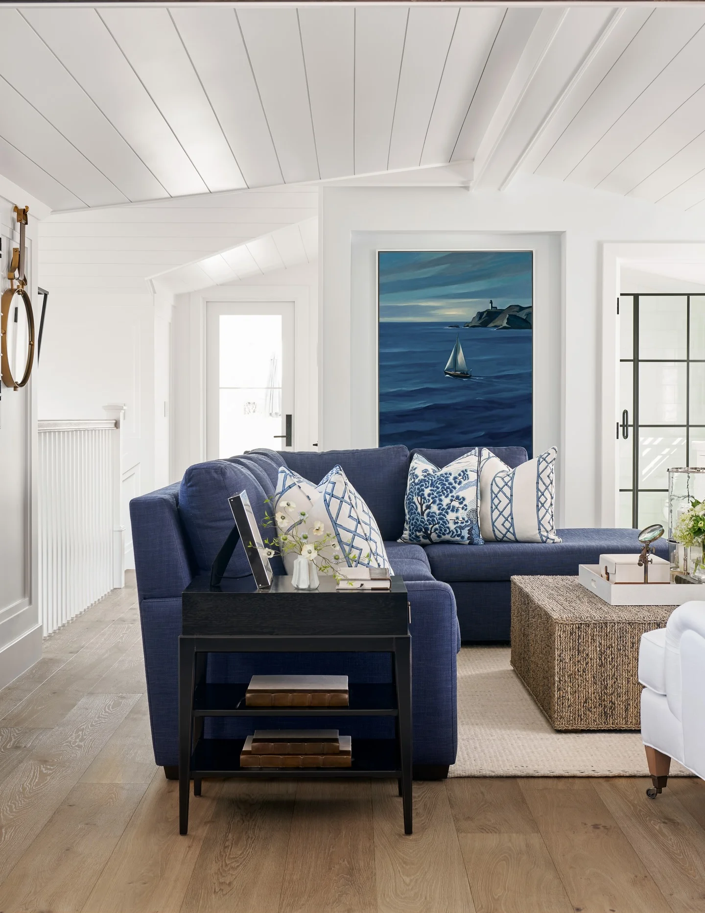
Image Credit: @barclaybutera on Instagram – Instagram post
Quick Facts: Cost: Low to medium | Time: One weekend | Skill Level: Beginner | Best For: Large sofas, accent walls and calm evening rooms
Paragraph: Navy blue gives a living room a classic, grounded feel, and it pairs well with cream, brass and warm wood. Use navy on a sofa or one wall, and keep the rest light so the room stays bright. Add cream cushions and soft light, and the deep blue feels rich, not dark.
Olive Green Earthy Calm
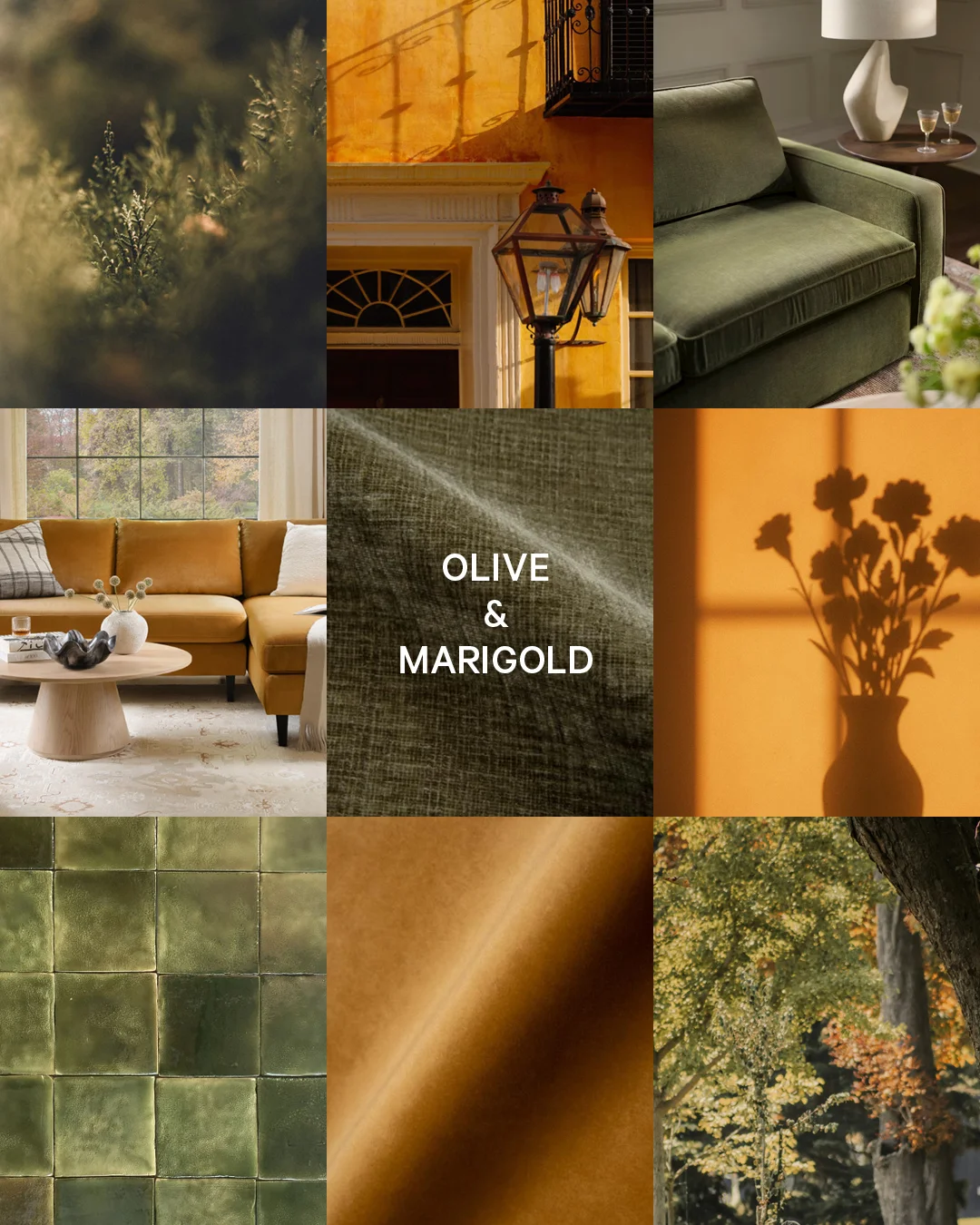
Image Credit: @interiordefine on Instagram – Instagram post
Olive green brings a quiet, earthy feel to a living room, and it pairs well with cream, mustard and warm wood. Use it on a sofa or cushions, and keep the rest light so the green feels fresh. Plants and light wood make olive feel natural and calm.
Add mustard cushions or a warm throw to stop olive looking dull, and use brass or wood details for warmth. Test the shade in daylight first, because olive can look grey in a dark room. With the right light, this earthy green makes the room feel grounded and restful.
Mustard Yellow Bright Pops
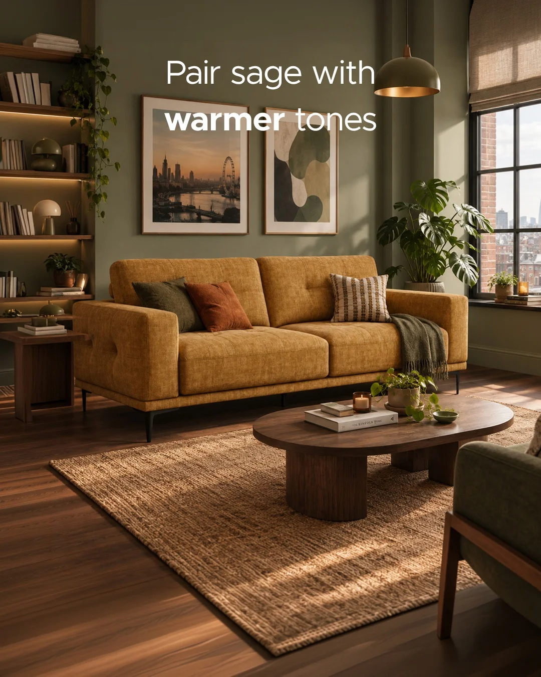
Image Credit: @poltronesofa_uk on Instagram – Instagram post
- Use mustard in small pops, such as cushions, a throw or a chair, and keep the base cream or sage.
- Pair mustard with olive green, warm wood and cream, because those tones calm the bright yellow.
- Add mustard art or a rug if you want a stronger look, but keep the rest of the room plain.
- Choose a soft, warm mustard, not a bright lemon yellow, for a calm room.
Mustard yellow adds sun to a dull room, and it works well in winter when light is low. Start with one cushion and see how it feels in daylight and in the evening. This bright accent suits small rooms, because a little colour goes a long way.
Warm Greige Modern Base
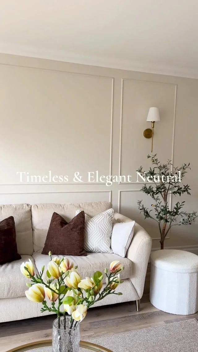
Image Credit: @thecolairowesleyhome on Instagram – Instagram post
Quick Tip:
Choose a warm greige with a soft beige undertone, not a cold grey, and test it on the wall first. Pair it with cream, light wood and black metal details, and add soft textiles so the room feels warm and modern.
Paragraph: Greige sits between grey and beige, and it suits most furniture without fighting it. Use it on walls, then add cream cushions, wood and one dark accent for contrast. This calm base makes it easy to change cushions with the seasons. It also works well in hallways and bedrooms.
Cream White Airy Light
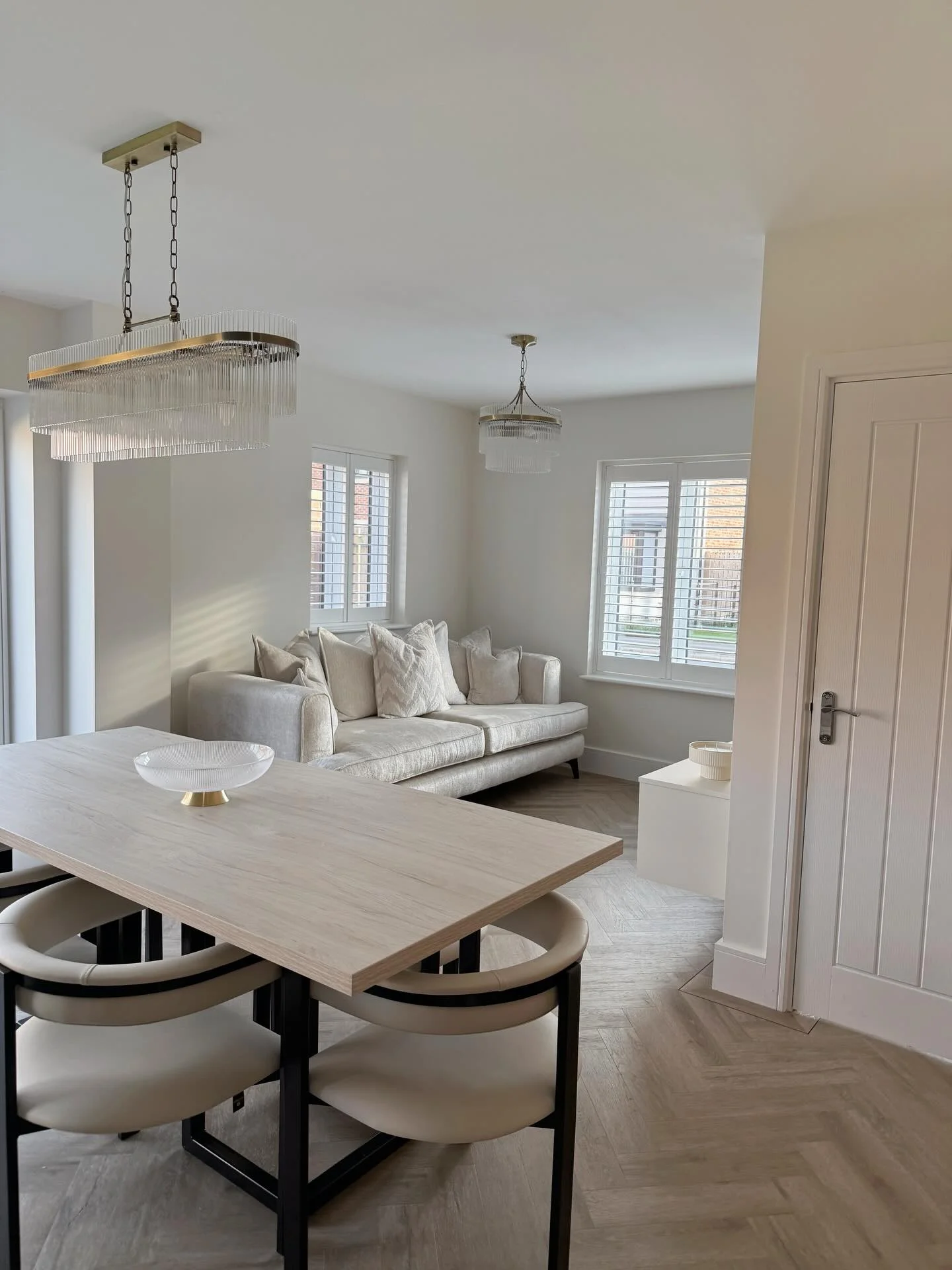
Image Credit: @homebydaniellex on Instagram – Instagram post
Before: A room with dark furniture and no light colours can feel heavy and closed in, even on a bright day. The walls look dull, and the seating feels far away from the window.
After: Cream white walls, a cream sofa and light wood make the same room feel open and airy. Soft light moves across the room, and the furniture looks lighter and closer together.
Paragraph: Cream white works best with warm wood, soft beige and one gentle accent, such as sage or blush. Add texture with linen, wool and woven baskets, so the white does not look flat. This light palette suits small rooms and dark corners. It keeps the room feeling fresh through the day.
Emerald Green Rich Velvet
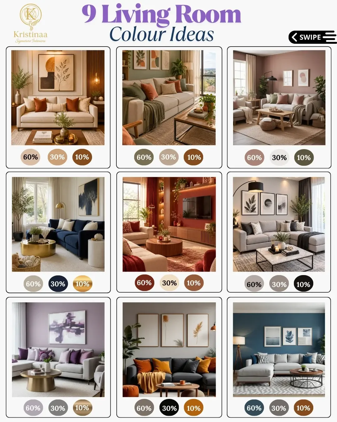
Image Credit: @kristinaa.signature.interiors on Instagram – Instagram post
Steps: 1. Choose one emerald piece, such as a velvet sofa or an armchair, and keep the walls cream. 2. Add brass, warm wood and cream cushions to balance the rich green. 3. Use soft light and a cream rug so the room stays bright. 4. Add one more green detail, such as a plant, to tie the scheme together.
Paragraph: Emerald green feels rich and calm, and it pairs well with cream, brass and dark wood. Use it as a focal point, not on every surface, so the room keeps its balance. With cream walls and warm light, emerald looks smart and welcoming for family and friends.
Warm Brown Wood Tones
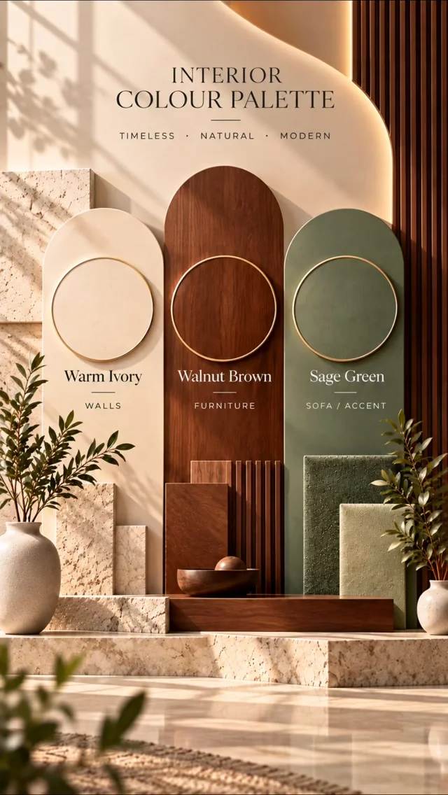
Image Credit: @homecraft.kolkata on Instagram – Instagram post
Do: Let warm brown wood lead the palette, with cream walls, beige cushions and soft green plants. Use wood in the floor, shelves and coffee table for a joined up look. Add cream textiles to soften the brown and keep the room light.
Don’t: Mix too many wood tones in one room, because the palette can look messy. Use dark brown on every surface, because the room can feel heavy. Forget soft light, because warm bulbs make wood look richer.
Paragraph: Warm brown wood adds depth and a natural feel, and it suits cream, beige and soft green. Keep the wood tones close, and use cream and plants to lift the room. This earthy palette suits family rooms and quiet evenings. It also suits rented homes, because wood and cream are easy to change.
Black White Crisp Contrast
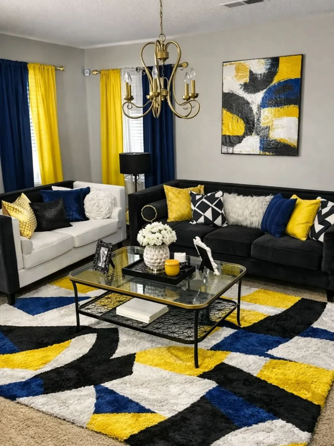
Image Credit: @exproxyflooring on Instagram – Instagram post
Quick Facts: Cost: Low | Time: One afternoon | Skill Level: Beginner | Best For: Small rooms, plain walls and bold art
Paragraph: Black and white gives a room a crisp, clear look, and it works best with one warm accent, such as wood or mustard. Use white as the base, black in frames, lamps and cushions, and keep the layout simple. Add soft texture so the contrast feels warm, not stark.
Soft Grey Cool Balance

Image Credit: @ihsansamhoun.interiors on Instagram – Instagram post
Soft grey walls and a grey sofa can feel calm, but they need warm details to stop the room feeling cold. Add cream cushions, light wood and soft beige, and the grey starts to feel gentle. A warm rug and soft light help the room feel lived in, not bare.
Use grey with a warm undertone, and test it in daylight before you paint a whole wall. Pair it with cream, blush or sage for a soft look, and add one dark accent for depth. With warm textiles, this cool balance suits most homes and most light.
Butter Yellow Gentle Glow
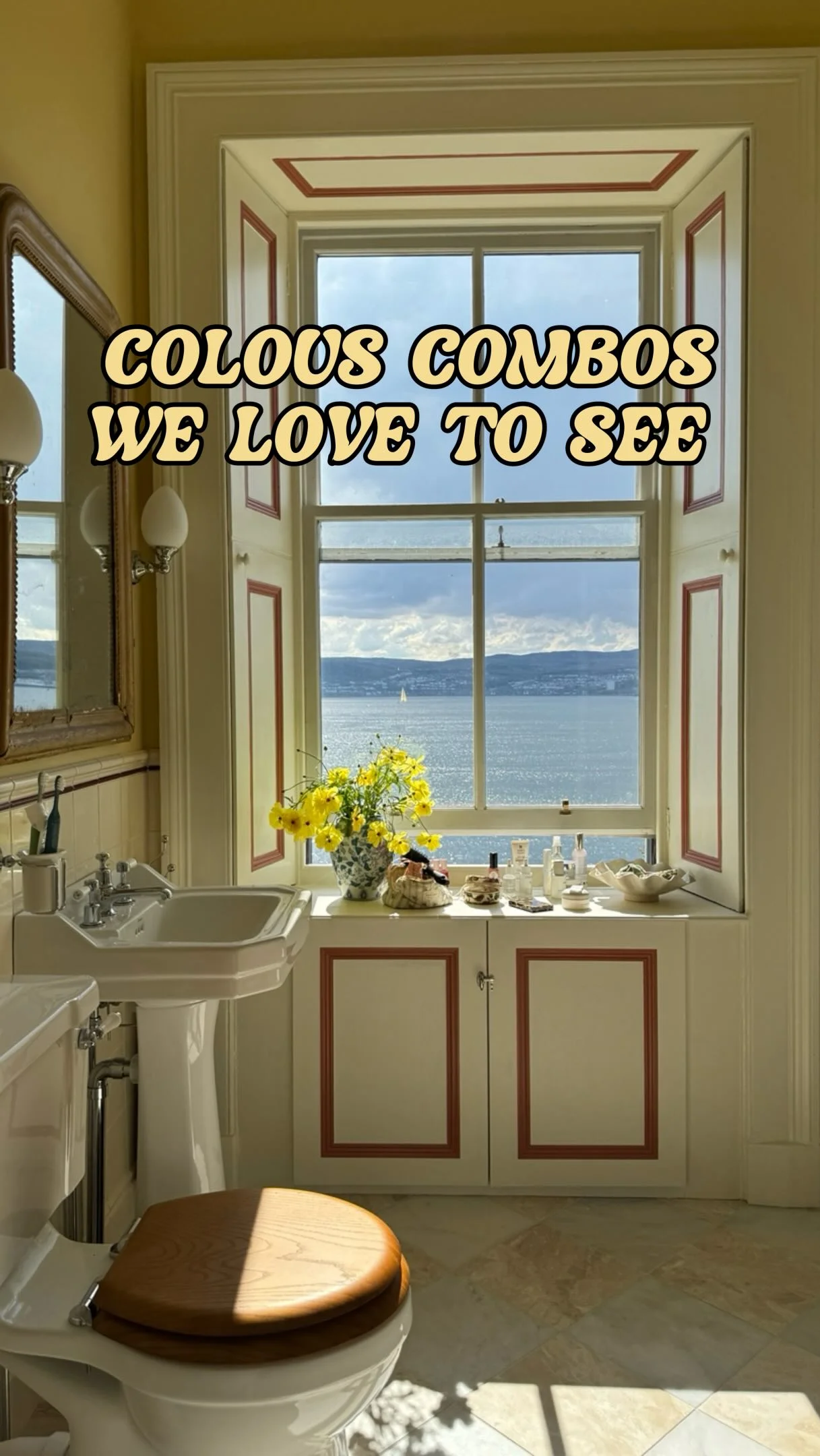
Image Credit: @patriciarodi on Instagram – Instagram post
- Paint one wall butter yellow or use yellow cushions, and keep the rest cream and light wood.
- Pair butter yellow with camel, rosewood and cream for a soft, grown up look.
- Add white curtains and soft light, because they keep the yellow feeling gentle.
- Use yellow art or a rug if you want more colour, but keep the base calm.
Butter yellow adds a gentle glow to a dull room, and it suits north facing rooms with cool light. Start with cushions or a throw, then try a wall if you love the tone. This soft yellow makes mornings feel brighter and warmer for the whole family.
Teal Blue Fresh Energy
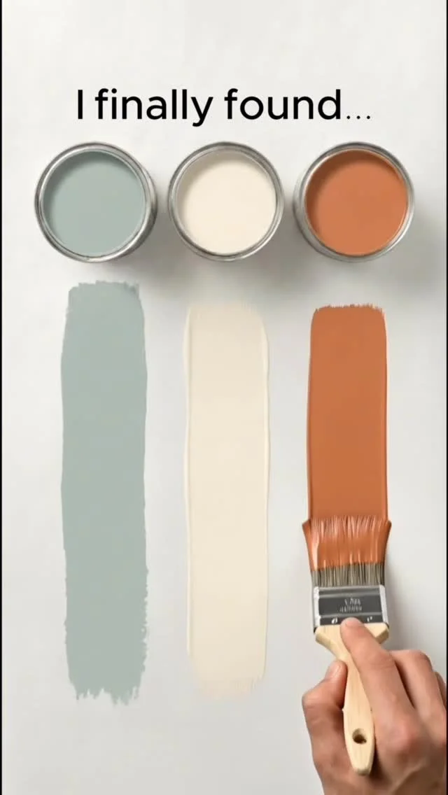
Image Credit: @colorharmonypalettesofficial on Instagram – Instagram post
Quick Tip:
Use teal as a strong accent on a sofa, cushions or one wall, and pair it with soft grey, cream and warm wood. Keep the rest of the room calm, so the teal feels fresh and not loud.
Paragraph: Teal brings fresh energy to a plain room, and it pairs well with grey, cream and light wood. Start with cushions or a throw, and add a rug if you want a bolder look. This rich blue green suits rooms that need a little life.
Rust Orange Autumn Warmth

Image Credit: @_wellcraft_ on Instagram – Instagram post
Before: A cream room with beige furniture can look tidy but a little flat, and nothing in the room feels warm or rich. The seating looks plain, and the walls feel bare.
After: Rust orange cushions, a warm throw and a clay pot give the same room an autumn glow. Cream walls, wood and soft light make the rust feel rich, and the room becomes a place to sit and stay.
Paragraph: Rust orange pairs well with cream, olive, wood and soft brown, and it suits autumn and winter light. Use it in cushions and throws first, then add art or a rug. This warm tone brings depth to a plain room. Add it slowly, and the room will feel richer without feeling dark.
Lavender Grey Quiet Softness
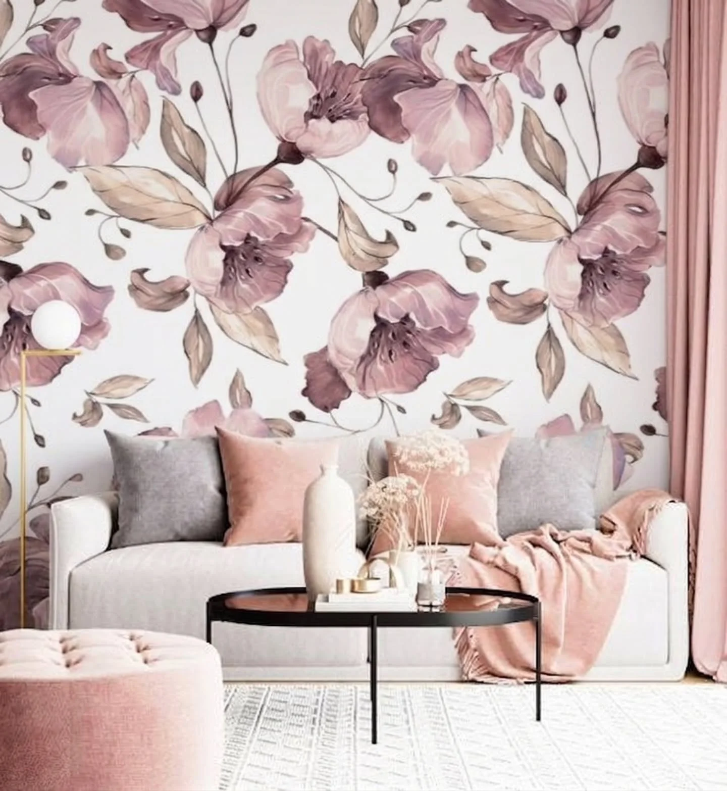
Image Credit: @arteia.amber on Instagram – Instagram post
Steps: 1. Use lavender grey on cushions, a throw or one wall, and keep the base cream or soft grey. 2. Add mauve, dusty rose and light wood for a soft, calm mix. 3. Use white curtains and soft light to keep the palette gentle. 4. Add one darker detail, such as charcoal, for a little depth.
Paragraph: Lavender grey feels quiet and soft, and it pairs well with cream, mauve and light wood. Use it in small layers first, because too much can feel cold. With warm light and soft textiles, this gentle palette suits calm evenings. It also pairs well with white bedding and soft grey rugs in nearby rooms.
Monochrome Beige Layered Tones
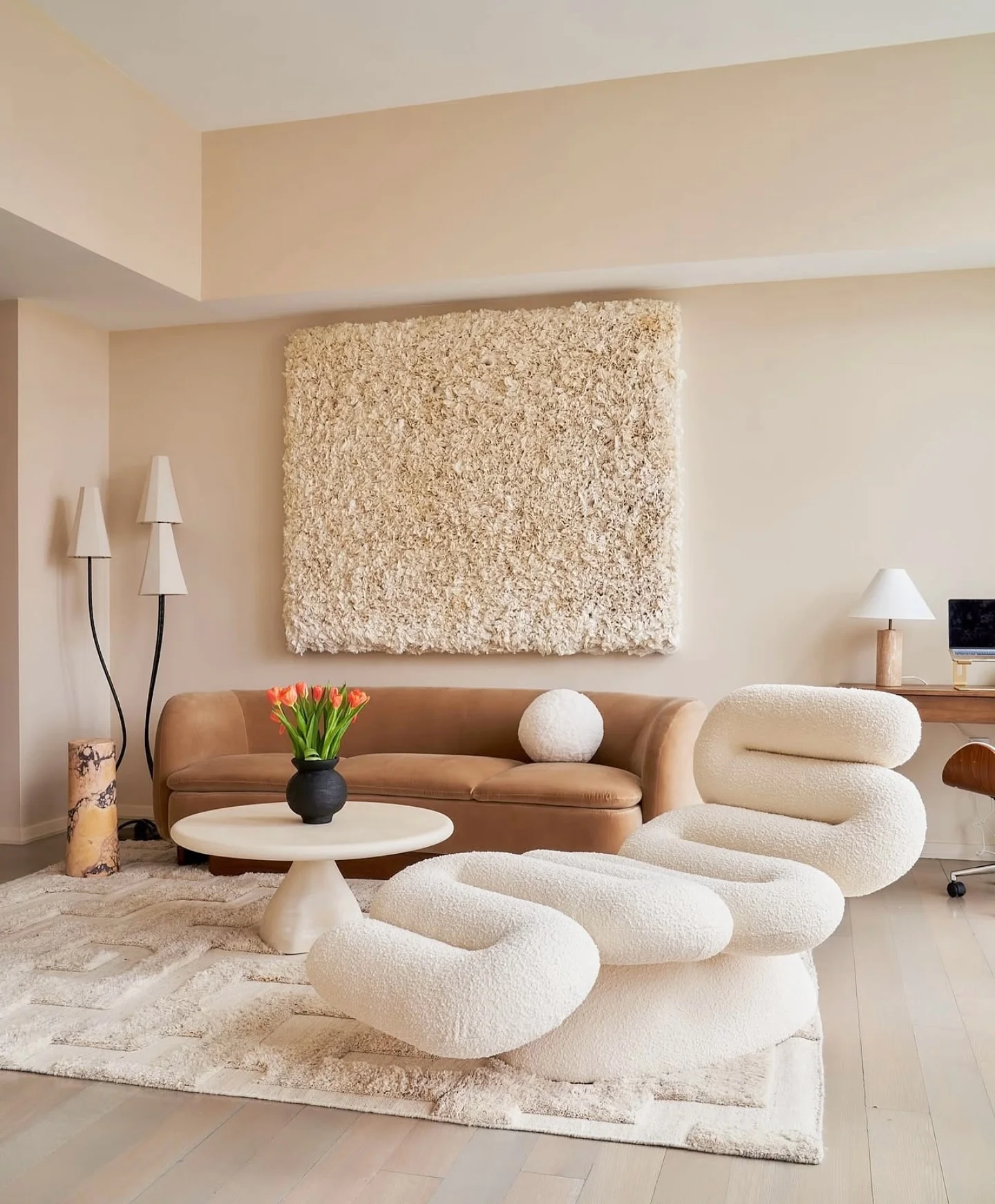
Image Credit: @jonathanadler on Instagram – Instagram post
Do: Layer beige in different shades, from cream to sand to stone brown, and use texture to keep it interesting. Mix linen, wool, wood and woven baskets, so the room feels rich without bright colour. Add one dark frame or lamp for a little contrast.
Don’t: Use one flat beige on every surface, because the room can look dull. Forget texture, because texture is what makes a beige room work. Add too many bright colours, because they break the calm palette.
Paragraph: A monochrome beige scheme feels calm and timeless, and it suits most furniture and most light. Layer shades and textures, and step back often to check the balance. This soft palette makes a small room feel larger and more peaceful. It also works well in bedrooms and hallways.
Conclusion
Your room does not need to be perfect to feel warm and welcoming. It only needs a palette that suits your light, your furniture and the way you live. Start with one of these living room color schemes, try it in one corner, and live with it for a few days before you add more colour. In my experience, slow changes last longer than a rushed makeover, because you learn what your room really needs. Save this post on Pinterest so you can find it again, try one idea this week, and share it with a friend who wants a softer home too.